UX Innovation in Unexpected Places: The Cash Machine
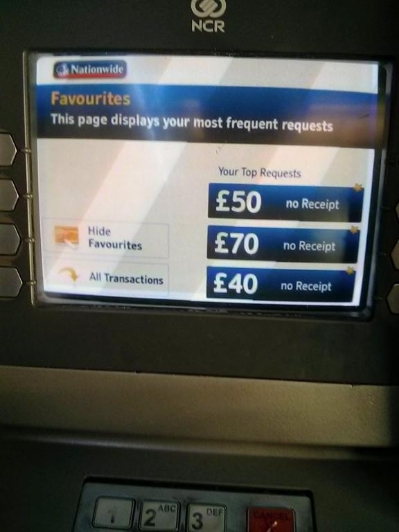
 I noticed a new feature on Nationwide cash machines recently. Instead of the usual flow of:
- request pin
- ask what service you want (99.9% it's gimmie cash)
- ask how much
- get money
Nationwide have changed to to:
- request pin
- show you your favourite actions
- get money
This is especially useful if you tend to take out amounts of cash that aren't in the usual list of options.
Why wasn't this a thing 20 years ago?